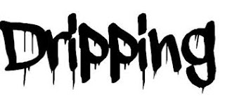
Fonts for the titles of the movie.
These depend on the genre of the movie. Typically, designers and editors include colours that represent the mood/atmosphere of the film. For example, a gory movie may have a red theme. I looked into specific horror movie fonts for titles and here are a few examples.
 |
| The designer starts with finding/creating a font that relates to the film. Horror films will most likely have some variation of scary font such as scratchings, 'dripping' font to represent blood or a font that looks like it has sections missing or has been scratched off. |
 |
| After finding the correct font, the designer will involve a colour palette that also emphasises the mood or atmosphere of the film. The colours of the title of the film are also usually contrasting to the background so it is bold and stands out more. |
 |
| When all features are added together (Credits/involvements included) an advertisement or opening scenes for the film should look like this. |
Some examples of well known horror/action film titles are below:
 |
| Silence of the Lambs, a famous horror film. Bold and dark letters to give audience a sense of whats to come. |
 |
| Hanna, an iconic drama/action film with bold, striking letters to emphasise the name. |
 |
| This horror film focuses on the effect of blood splatters being used in the title screen, to enhance the fact that it is of horror genre and murder/gore is to come. |


No comments:
Post a Comment